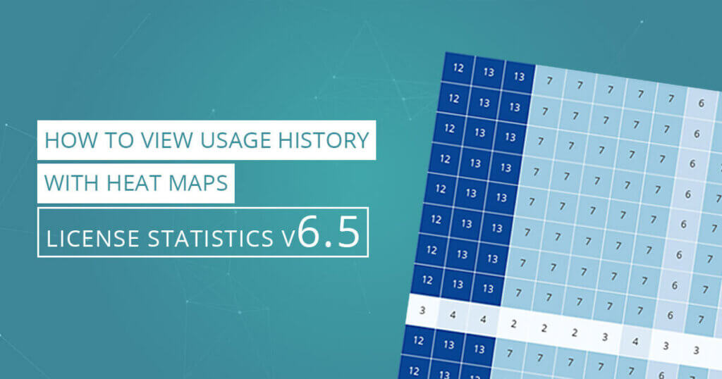
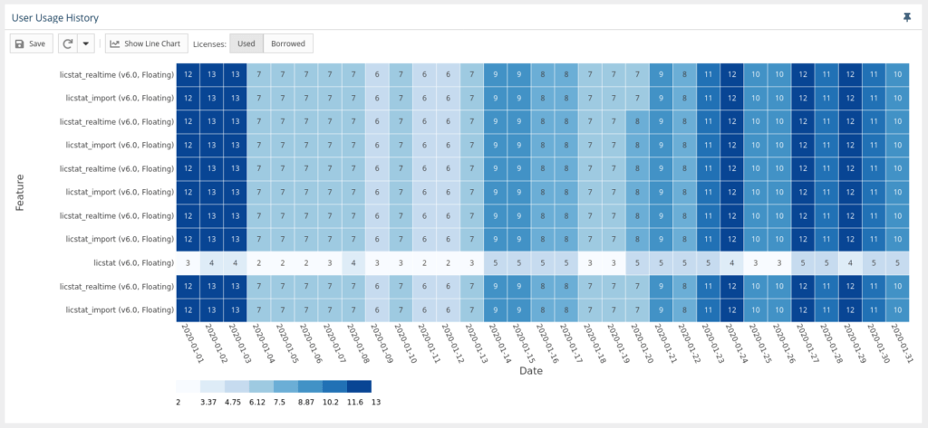
With License Statistics v6.5 you can view the Usage History Graph as a heat map in which Usage History values are represented as colors. The Usage History Heat Map provides a graphical representation of the number of licenses used by the selected user/user group for a specified time period.
One of the tools introduced in License Statistics v6.5 is the Usage History Heat Map, part of the User Usage History page. The Usage History Heat Map can help you quickly identify trends in usage history.
Here’s how to use the Usage History Heat Map.
Viewing the Usage History Heat Map
To view a heat map, select a desired grouping in the User Usage History Settings area. The Heat Map for the desired grouping and time frame is the default visible chart. Click the “Show Line Chart” button at the top of the graph to display the line chart instead. (For details see the User Usage History page.)
Using the Heat Map
The Usage History Heat Map allows you to toggle between Used and Borrowed licenses. The value in each block of the heat map is the number of licenses used or borrowed by the grouping and time range selected in the Settings section at the top of the User Usage History page. The map’s X axis represents the grouping you selected, and the Y axis represents the features used by that grouping in the selected time range.
The darker sections reflect heavier license usage, while the lightest sections reflect lower usage. At a glance you can quickly see license usage trends by date range and license feature set. This intuitive display of statistical data can help you better understand how licenses and license features are being used so you can better plan for optimal usage and license distribution in the future.
Get to know License Statistics
[vc_row][vc_column width=”1/3″][vc_btn title=”GET TRIAL” color=”turquoise” size=”lg” align=”center” i_icon_fontawesome=”fa fa-balance-scale” add_icon=”true” link=”url:https%3A%2F%2Fwww.x-formation.com%2Flicense-statistics%2Fget-trial-version%2F|title:Get%20trial|target:%20_blank|”][/vc_column][vc_column width=”1/3″][vc_btn title=”GET PRICING” color=”turquoise” size=”lg” align=”center” i_icon_fontawesome=”fa fa-usd” add_icon=”true” link=”url:https%3A%2F%2Fwww.x-formation.com%2Flicense-statistics%2Fpricing%2F|title:Get%20pricing%20info|target:%20_blank|”][/vc_column][vc_column width=”1/3″][vc_btn title=”VIEW LIVE DEMO” color=”turquoise” size=”lg” align=”center” i_icon_fontawesome=”fa fa-desktop” add_icon=”true” link=”url:https%3A%2F%2Flicstat-demo.x-formation.com%2F%23demo|title:View%20live%20Demo|target:%20_blank|”][/vc_column][/vc_row]